Dark Mode
I recently added the dark mode support to this blog. Here's what I have done and have learned from it.
Dark mode 101
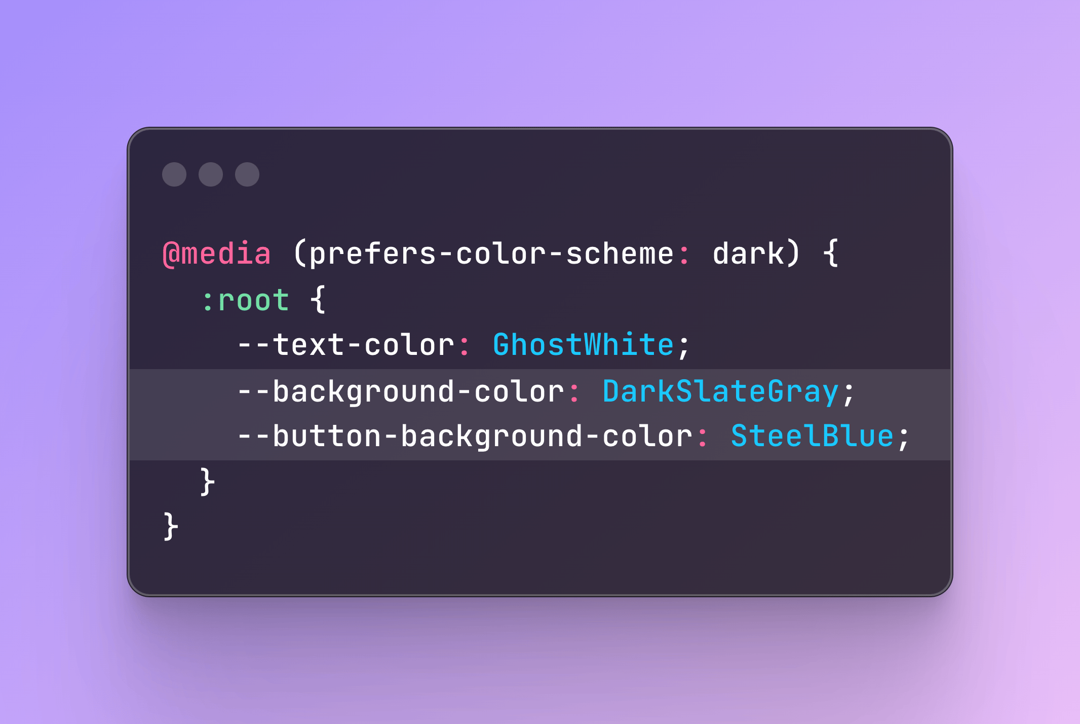
Dark mode styles can be added to a website by using the media query @media (prefers-color-scheme: dark) {} and add CSS rules that only would apply when dark mode is activated.
body {
  background-color: white;
  color: black;
}

button {
  border: 0;
  background-color: lavender;
}

@media (prefers-color-scheme: dark) {
  body {
    background-color: black;
    color: white;
  }

  button {
    background-color: slateblue;
  }
}
A common pattern is to use CSS variables instead of writing the same selector twice.
:root {
  --text-color: #000;
  --background-color: #fff;
  --button-background-color: lavender;
}

@media (prefers-color-scheme: dark) {
  :root {
    --text-color: #fff;
    --background-color: #000;
    --button-background-color: slateblue;
  }
}

body {
  color: var(--text-color);
  background-color: var(--background-color);
}

button {
  background-color: var(--button-background-color);
}
Adding Dark Mode Styles with Tailwind
I plan to add a control so the user can toggle between light and dark theme manually. The default theme should derive from the user's preferred color scheme.
TailwindCSS has dark mode support built in with the dark: variant. For example, this works out of the box:
<div class="bg-white dark:bg-black">
  <h1 class="text-black dark:text-white">Hello world!</h1>
</div>
Classes in the dark: variant would apply automatically when the user has dark mode activated.
First, in Tailwind config file, I add
darkMode: 'selector'to tell Tailwind that I would add the dark mode class myself to one of the root elements. This means if the <html> or <body> tag has the class .dark applied, the child elements would use the styles from the dark: variant instead of the default ones.
I start by manually adding the .dark class to <html> element, go through pages I have, and add :dark variant to elements where they need.
<body class="... dark:bg-zinc-900">
  <nav class="... dark:text-slate-200">
I don't have actual design for the dark mode so I just play around with built-in colors from Tailwind until I get a somewhat OK look and feel of it.
I'm also using Typography plugin from Tailwind for this blog. I can add .dark:prose-invert variant to my .prose element that gives a pretty good overall styles in dark mode for most of the text elements.
I learned from CSS-Tricks that it's a good idea to reduce brightness and contrast of images in dark mode. It can be done using brightness and contrast CSS filters, or in my case I just reduce the opacity to be at 80%.
.dark img {
  @apply opacity-80 transition-opacity;
}

.dark img:hover {
  @apply opacity-100;
}
Switching Between Light and Dark Modes
I create a <ThemeToggler> Astro component that contains a button to toggle between light and dark theme.
I take a sun icon and a moon icon from Lucide, inline the SVG code in a button, and give each SVG a class for styling. When the button is clicked, it switches the displaying icon between the sun and the moon icon.
<style is:global>
  .icon-moon,
  .dark .icon-sun {
    display: block;
  }

  .icon-sun,
  .dark .icon-moon
  {
    display: none;
  }
</style>
<button id="theme-toggler" ...>
  <svg class="icon-sun" ...></svg>
  <svg class="icon-moon" class="hidden" ...></svg>
</button>
For the logic of the button to toggle the theme, I use the code from Astro's tutorial, then slightly modify it.
<script is:inline>
  const themeToggler = document.getElementById("theme-toggler");

  const setTheme = (theme) => {
    const isLightTheme = theme === 'light';
    document.documentElement.classList.toggle("dark", !isLightTheme);
    localStorage.setItem('theme', theme);
  };

  // Function to handle theme toggle click
  const handleToggleClick = () => {
    const isDark = document.documentElement.classList.contains('dark');
    setTheme(isDark ? 'light' : 'dark');
  };

  themeToggler.addEventListener("click", handleToggleClick);
</script>
I also borrow the code from web.dev on Building a theme switch component to synchronize the theme with the system setting when it changes.
window.matchMedia('(prefers-color-scheme: dark)')
  .addEventListener('change', ({ matches: isDark }) => {
    const theme = isDark ? 'dark' : 'light'
    setTheme(theme);
  });
Setting the Initial Theme
The initial theme should reflect the saved settings, or otherwise should reflect the system settings. And to prevent flashing of the content, the code should run as early as possible. So I put in the <head> tag. This is another technique I borrow from the web.dev article.
<head>
...
<script is:inline>
  const getInitialTheme = () => {
    if (typeof localStorage !== "undefined" && localStorage.getItem("theme")) {
      return localStorage.getItem("theme");
    }
    if (window.matchMedia("(prefers-color-scheme: dark)").matches) {
      return 'dark';
    }
    return 'light';
  };

  const initialTheme = getInitialTheme();
  document.firstElementChild.classList.add(initialTheme);
</script>
...
</head>
Giscus in Dark Mode
I'm using Giscus for the comments section. It has theming support via data-theme attribute. To set the Giscus theme based on the current theme that has been set, I updated the Giscus code snippet to use document.createElement() instead of the normal <script> tag.
<div class="mt-12" id="comments"></div>
<script is:inline>
  const isDark = document.documentElement.classList.contains('dark');
  const theme = isDark ? 'dark_dimmed' : 'preferred_color_scheme';

  const scriptTag = document.createElement('script');
  scriptTag.src = "https://giscus.app/client.js";
  scriptTag.setAttribute('data-repo', 'armno/armno.in.th');
  scriptTag.setAttribute('data-repo-id', 'zmk');
  scriptTag.setAttribute('data-category', 'Blog Post Comments');
  scriptTag.setAttribute('data-category-id', 'qmk');
  scriptTag.setAttribute('data-mapping', 'pathname');
  scriptTag.setAttribute('data-strict', '0');
  scriptTag.setAttribute('data-reactions-enabled', '1');
  scriptTag.setAttribute('data-emit-metadata', '0');
  scriptTag.setAttribute('data-input-position', 'top');
  scriptTag.setAttribute('data-theme', theme);
  scriptTag.setAttribute('data-lang', 'en');
  scriptTag.setAttribute('data-loading', 'lazy');
  scriptTag.setAttribute('crossorigin', 'anonymous');
  scriptTag.async = true;

  document.querySelector('#comments').appendChild(scriptTag);
</script>
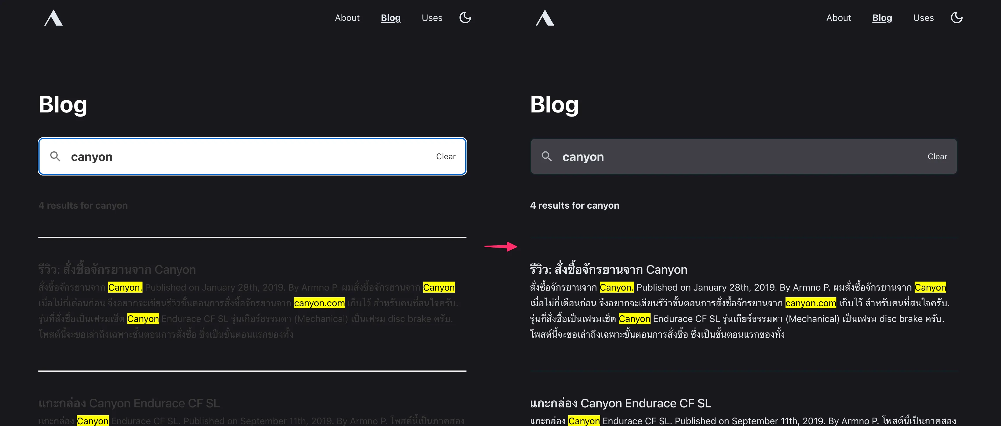
PageFind in Dark Mode
Another library I use that needs some adjustments for the dark mode is PageFind - the search tool that I implemented on the blog listing page. The documentation page has a guide to customize the styles for dark mode, which can be done by setting some CSS variables.
.dark {
  --pagefind-ui-primary: #e5e7eb;
  --pagefind-ui-text: #e5e7eb;
  --pagefind-ui-background: #3f3f46;
  --pagefind-ui-border: #152028;
  --pagefind-ui-tag: #152028;
}
Summary
My dark theme is still not perfect, but at least now I have it. Overall it was a fun little tweak. I have learned a few new things from implementing dark mode to this blog.
I will continue tweaking it from time to time as there are still some areas to improve. I want to look into color-scheme CSS property and see if I can use it here. Also it would be great if dark mode can be set properly even without JavaScript. That will be in a follow-up post then.
✌️
Related posts