I recently spot this weird behavior on my blog: there is a blink for a split second on page load.
After the page loads, everything looks fine. This sometimes happens too fast so it is barely noticeable.
Another thing I notice now is that: the shift happens only on the main content container. The header element stays the same.
The issue seems tiny, but I still want to fix it because I can't unsee it now. Maybe I learn a thing or two from the process as well.
Inspecting the problem
The bug is pretty difficult to see. Luckily it happens on every first load, so it is easy to reproduce. If I slow things down, I might see things more clearly.
I use Chrome DevTools' Network Throttling feature to disable network cache, and throttle the connection speed to 'Slow 4G'.

It works. I can see what is happening: initially, the content are was wider, the it got narrower. Something is moving there.
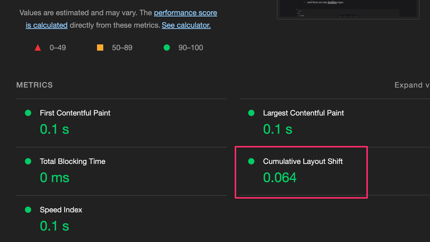
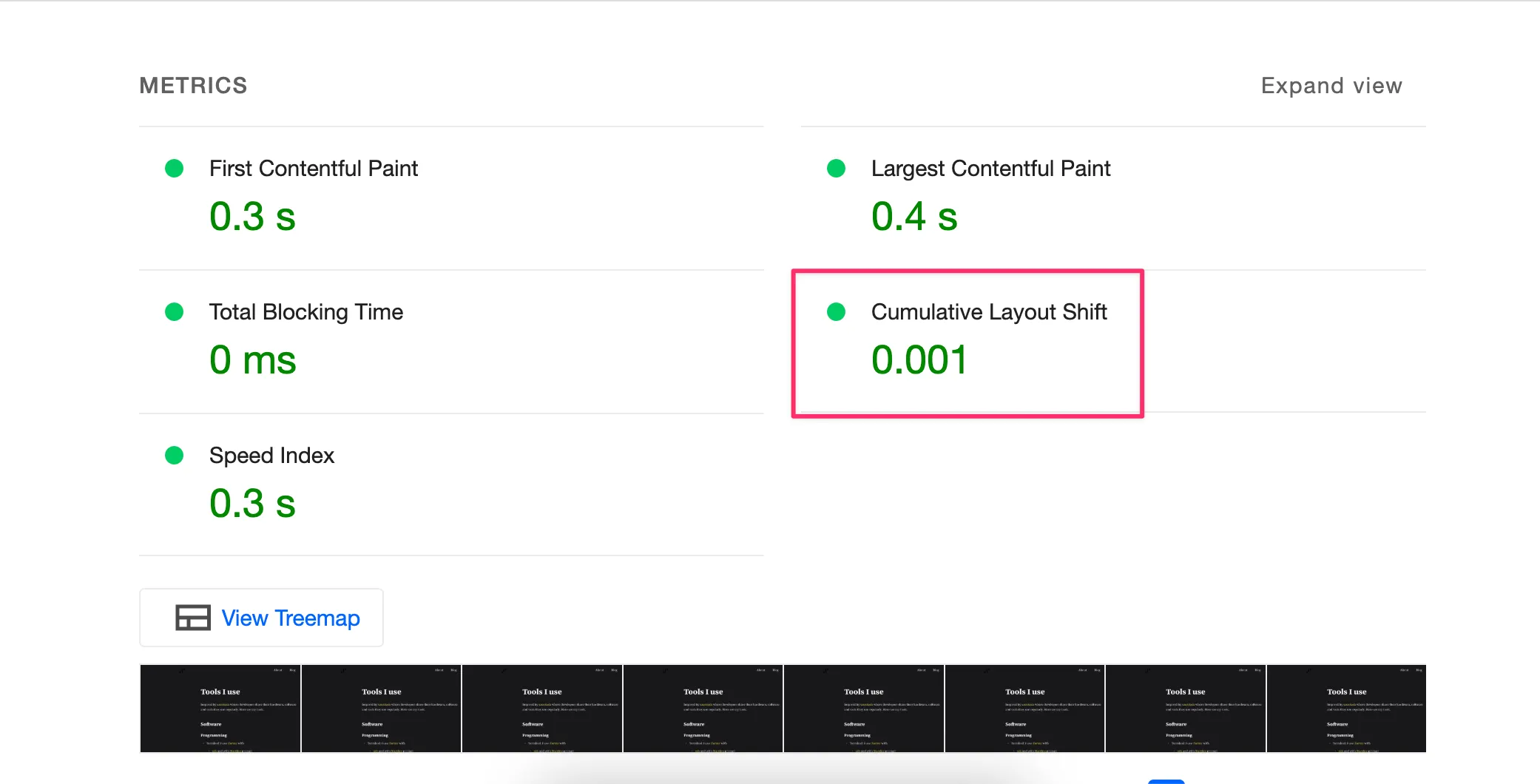
My guess is that something might cause the CLS: Cumulative Layout Shift. So I jump to the Lighthouse tab in DevTools and run an audit (with network throttling still enabled).
Lighthouse shows that there is a small amount of CLS.

Lighthouse also tells me that the source of the CLS is from the web fonts load events.
I'm using 2 custom fonts and the system's sans-serif as a fallback in my fonts stack. I'm also using font-display: swap property. More details on the fonts stack later.
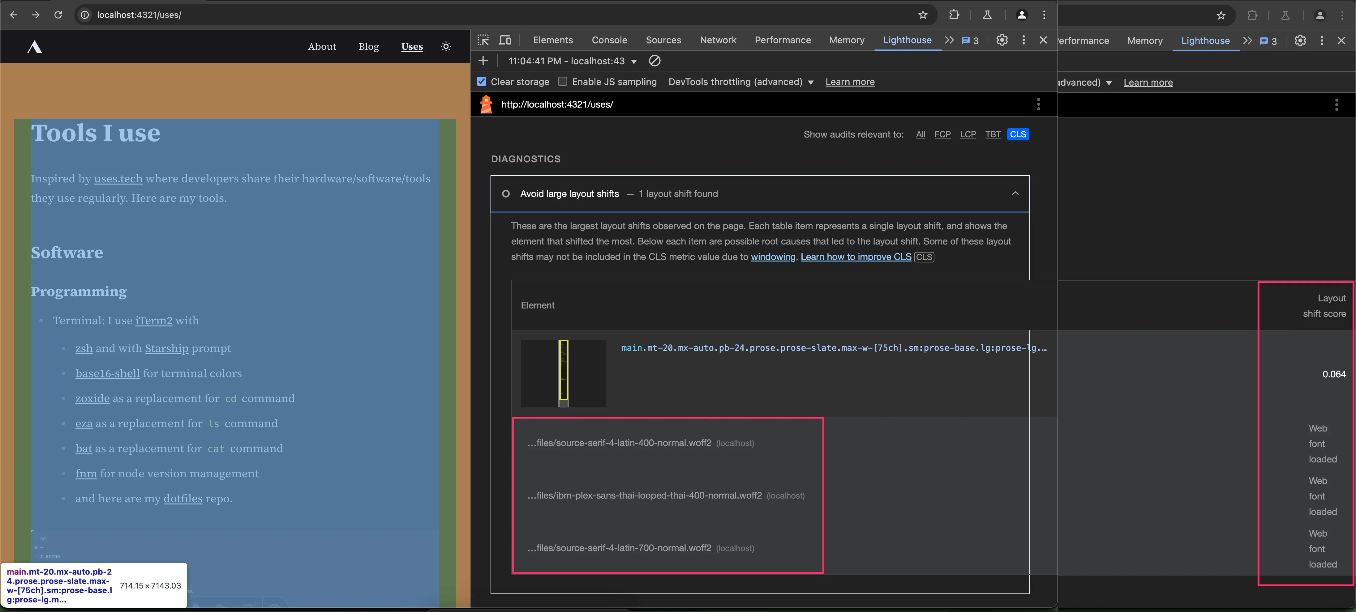
So when the custom fonts are loaded, it causes the layout shift.
To verify if fonts loading is the real cause of the layout shift, I use the network blocking feature to prevent the font files to load on the page, run another audit, and see if the issue is gone.
And yes it is indeed gone. No more layout shifts.

Digging a bit deeper I found the main content is a .prose element from the Tailwind typography plugin. This class sets the max-width of the element to be 65ch.
The optimal line length for body text is around 50-75 characters. Tailwind uses 65ch which is roughly about 65 characters. According to MDN, 1ch is measured from the width of the character 0 of the current font.
And because the "current font" changes from system sans-serif to Source Serif 4, the actual width of 1ch and changes too.
65ch doesn't necessarily mean it will always be fixed at XYZ pixels. If the font changes, the width might change, and the layout might shift.
Gotcha.
Lesson learned: when using font-display: swap , I have to be careful with the fallback font stacks. Choosing the fallback font poorly can lead to negative side effects like this.
Solving the layout shift from using custom font
I did some further research and found the article Fixing Layout Shifts Caused by Web Fonts by Umar Hansa explaining the similar issue I have.
In my case, there are a few solutions to fix layout shift:
- use a fixed width unit for the container like
pxorreminstead ofch. - use
chunit, but choose a better fallback font. - use
chunit, with some other CSS properties for@font-facerules to tweak how the font should display.
1. Set a fixed width unit for the container
This can be done in Tailwind's config file tailwind.config.ts
export default {
  theme: {
    extend: {
      typography: {
        DEFAULT: {
          css: {
+           maxWidth: '700px',
          }
        }
      }
    }
  }
}
This will set the max-width for .prose elements to be 700px instead of 65ch. The text or line breaks might still shift when font changes, but the content container will not move.
2. Set better fallback font
First I should at least set the fallback font to serif instead of sans-serif I imported from Tailwind.
export default {
  theme: {
    fontFamily: {
      serif: [
       'Source Serif 4',
       'IBM Plex Sans Thai Looped',
-      ...defaultTheme.fontFamily.sans,
+      ...defaultTheme.fontFamily.serif,
      ]
    },
On macOS, the fallback font is Georgia. The differences is still quite a lot at ~100px though. Here is the comparison between the 2 fonts.
I can also use Times instead of Georgia as a fallback. Times font is visually narrower than Georgia and would reduce the margins. But personally I don't like how Times looks so I wouldn't use it.
However, with both techniques combined, it gives an OK result. There is almost no visual layout shift, and CLS value from Lighthouse is much lower.
3. Adjust the fallback font's display with @font-face descriptors
Spoiler alert: I end up not implementing this technique because the result I got was not better. Below are notes from what I have learned from trying it out.
This method is to create a tweaked version of the system font Georgia to make it visually appears closer to the Source Serif 4.
There are a few CSS properties for that can be added to @font-face rules to control how the font should display such as the size-adjust property that is supported by all browsers, or line-gap-override, ascent-override, or descent-override that are not supported yet in Safari.
These properties are all new to me. I have never used them before. Luckily there is a tool like Fallback Font Generator to help.
I go to website, upload Source Serif 4 as a brand font, and select Georgia as a fallback font. I adjust the controls until both fonts are somewhat aligned in the preview area. The tool gives me the output CSS code that defines the adjusted Georgia @font-face rule.

I add the new @font-face rule to the page, and update Tailwind config to use the adjusted Georgia as a fallback font. The first test didn't give the convincing result so I adjust the numbers a bit.
<head>
  <style>
  @font-face {
    font-family: 'Adjusted Georgia Fallback';
    src: local(Georgia);
    size-adjust: 87%;
  }
  </style>
</head>
export default {
theme: {
fontFamily: {
serif: [
'Source Serif 4',
'IBM Plex Sans Thai Looped',
- ...defaultTheme.fontFamily.serif,
+ 'Adjusted Georgia Fallback',
+ ...defaultTheme.fontFamily.serif,
]
},I end up with size-adjust: 87% which gives the visual width of 65ch of the content container closer to when using Source Serif 4 font. Rendered text still look quite different visually though.
There is another problem I face: I'm actually using 2 custom fonts for this website. This is the order of the fonts stack:
- Source Serif 4 - for most of the characters. This font doesn't have Thai characters in it, so there comes the second custom font...
- IBM Plex Sans Thai Looped - for Thai characters. It is imported as an individual subset from Fontsource.
- the Adjusted Georgia Fallback from above
- the default serif fonts stack from Tailwind
When putting IBM Plex Sans Thai Looped in, it causes another layout shift in between. From this video below, when reload the page, the layout goes from big > small > big again.
My guess is that the shrink in between is caused by the second font in the fonts stack e.g. from 65ch of the IBM Plex Sans Thai Looped font.
That means that the Adjusted Georgia Fallback custom font only fixes the layout shift for Source Serif 4. And if I want to minimize layout shift through all fonts in the stack, I would need to adjust the Georgia (or another font) to look closer to all other custom fonts I use.
Otherwise, I could use 1 custom font instead of 2, which I'm not interested in right now. I have spent too much time already picking fonts that look OK for both my English and Thai content, and prefer to keep it this way.
For me, it's easier to give up the 65ch max width and just go with the fixed width of the container element instead, which solves the horizontal layout shift issue regardless of the fonts I use.
It's a good learning so far anyway. ✌️
Related posts
